App management in Google Play
Google
2018-2020
It’s a common misconception that old apps can’t learn new tricks. But it’s also a misconception that a new look will solve old problems. We still have to make things genuinely better for the user. I was the lead content designer on a team assigned to do just that by updating the app and account management experience in Google Play.
The problem
The existing app management flow worked fine, but only if you wanted to do two things: update an app or reinstall an old app. Users were increasingly frustrated by the limited functionality. They wanted more information and better ways to manage their apps and devices in Google Play.

The solution

I worked directly with a UX designer and a PM to consolidate more useful information into one place and better organize it so that users could see what was going on a glance.
To keep things simple, we broke things down into two separate tabs: Overview and Manage. The Overview tab kept the existing information about available updates and apps that were a potential security threat (through a feature known as Play Protect) but expanded the utility with more specific alerts and notifications about statuses.
My main focus was simplicity of terminology and information architecture. Everything here needed to be quickly digestible, but also stay consistent with the rest of Play.

Then we added in information about how much space was available on the device (one of the most requested features from users). This led to a quick and simple way to manage available space by deleting unused apps.

To round things out, we added a couple other related features. One let users share apps with each other directly when there isn’t an internet connection available. The other was a deeplink to the user’s past ratings and reviews, which we rescued from a settings menu.
In a later update, we also added a way to manage how apps were synced across multiple devices.

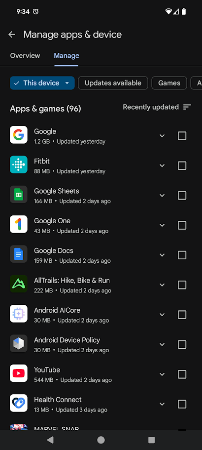
The Manage tab retained the functionality of the old page, namely letting users update, delete, or reinstall apps from their library, but we made it easier to find things in a large app library with filter chips. One of the chips also lets the user manage apps on their other devices from the one they're currently using.
For me, the cherry on top of this digital sundae was an opportunity to fix a style problem that had lingered for far too long. Google UX guidelines were trying to phase out first-person pronouns like "my" at the time. I decided this was the perfect moment to change the name of this page to "Manage apps & devices" because we were already arguing about everything else, so something minor like this could easily fly under the radar. The new name fit our style of using a noun or verb that indicates what a feature will do, and the inclusion of "devices" helped users know that they could do more than just manage apps.
The response to this project was generally positive from users, and leadership issued a spot bonus to me for my work. Sounds like a success, all around.