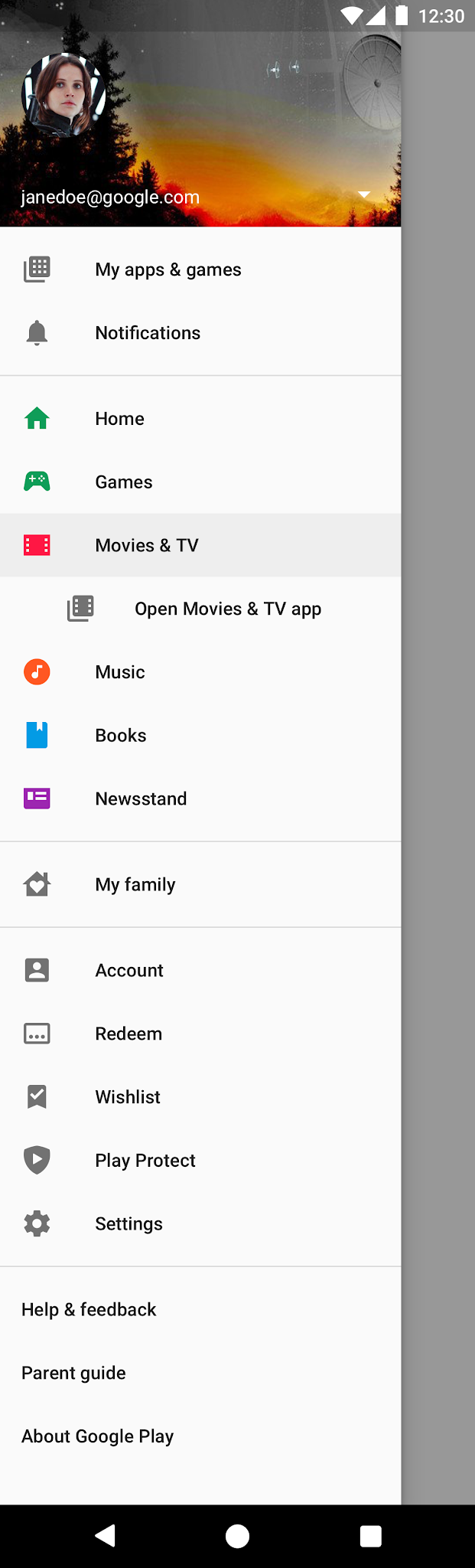
Menu navigation in Google Play
Google
2018-2020
Information architecture and taxonomy are the Sherpas of UX design: indispensable but underappreciated. No design can crest it’s own Everest without the IA carrying a lot of weight. And I’m a real sucker for taxonomizing a list of things. That’s why I was so excited to be the lead content designer for the complete overhaul of Google Play’s main menu.
The problem
People tend to gain a few extra pounds with age, but more surprisingly, app designs do, too. Google Play had been around for a while, and the many years of leadership pivots, additional features, and good ol' tech debt had left the menus long and needlessly complex.
The solution

There were two main phases. The first was to simply reorganize everything into a new taxonomy that was simpler, more intuitive, and easier to navigate (and got closer to, you know, actually fitting on a mobile screen).


The second phase further refined the taxonomy and organization and brought the visual design in line with Play’s new design system. We also made it easier to integrate Play Points statuses and the main Google account settings all in one place.

While the new design system dictated a lot of the visual changes, I was heavily involved in taxonomy and naming choices for the new menu. I worked directly with the lead UX designer through multiple rounds of post-it note sprints and whiteboarding. We consolidated many menu items by looking at how users were currently using Play. For example, external links for consumption apps weren't really a priority for most users, and concepts like payment management and subscription management were conceptually close enough that it made sense to group them.


The settings menus were in particularly bad shape, and the discussions and debates about them went on far longer. We had plenty of clever ideas but technical restrictions in the back-end constrained many of our plans.
Eventually we were able to wrangle the settings into five top-level categories. I tried to institute a more consistent naming structure for the settings themselves, although I wasn't as successful as I hoped to be. In several cases, historical consistency or legal concerns about changing names overruled my style guide. Compromise can hurt the idealist, but I think we ended up with the best possible outcome, given the situation.

All the changes to the main menu and settings pages made many of the leads worried that users would get lost, even in very simple flows. So we used the new design system for user education, with tooltip overlays that gently guided the user to new menus and highlighted were the most common features were.
Despite the concerns, it all seems to have worked out in the end. Testing showed that the vast majority of users quickly adjusted to the new navigation and resumed normal usage patterns. And I got a spot bonus, so leadership must have been pretty satisfied, too.