Google Play menu overhaul
Lead content designer
Google Play, 2018-2020
What I did
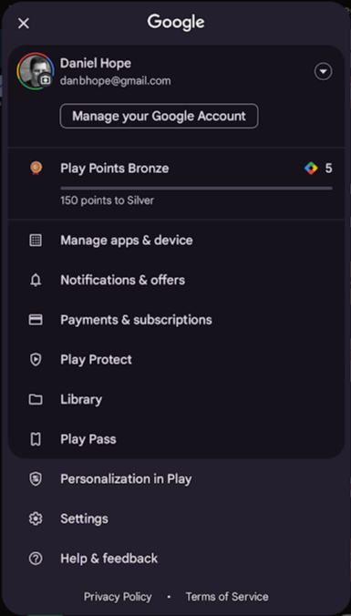
I heard that one of the designers was working on an overhaul of the Google Play main menu, and I quickly convinced him this was a content design project.
I love a tight taxonomy, and I quickly won over the designer and the PM by showing them the value of paring things down and making names consistent. I also created a set of rules for what goes where, so when new products or settings are added they won’t clutter the menu up again.
Before
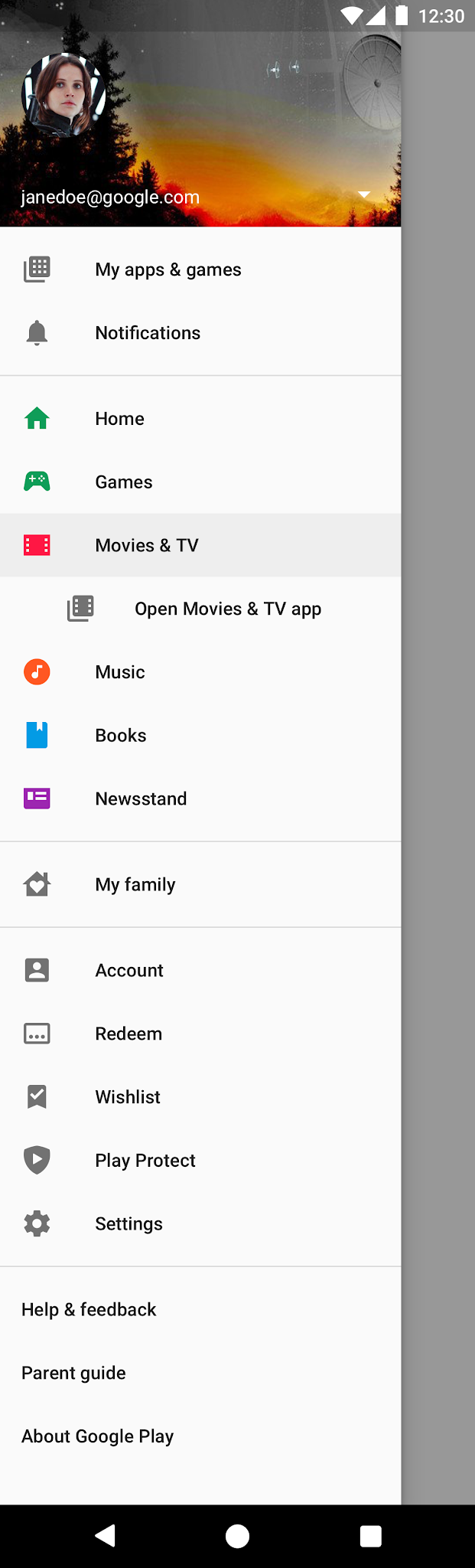
After

Taxonomy exercise

What I did … v2
We were so successful that we got the go ahead for another round. This time we used existing design elements to move valuable info (like Play Points) up to the top level, and I pushed for us to clean up some names the entire Settings taxonomy.
I spent weeks arguing with engineers and PMs about the meanings and connotations of various technical terms, but I managed to keep them from structuring it like the code base. I narrowed the top-level categories down to five, which made navigation and exploration much easier for the end user.